
Cyberpunk Alley
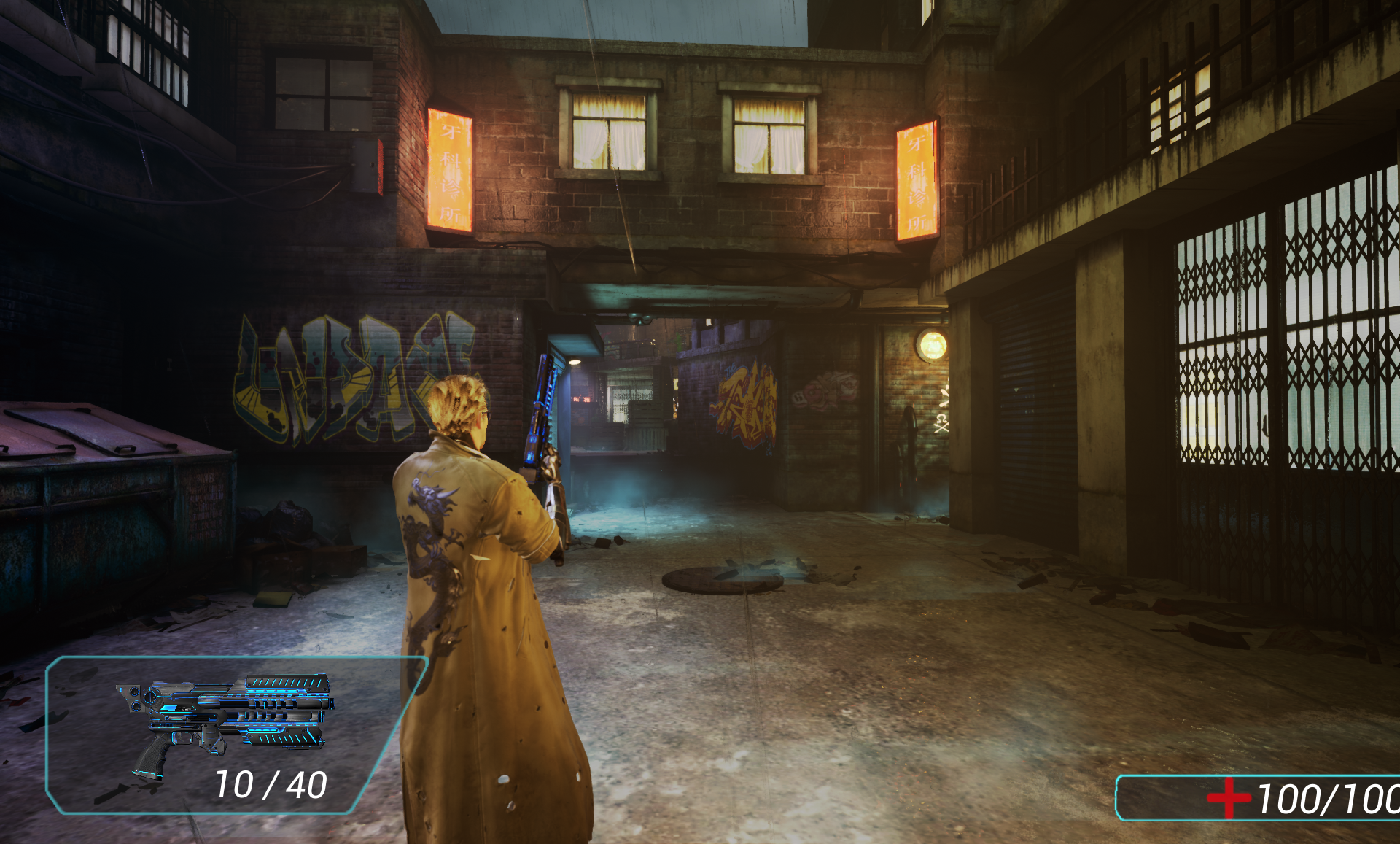
Cyberpunk Alley is a third-person action shooter solo project developed and iterated on through the full cycle of production over the course of four months. Inspired by games like Deus Ex and Watchdogs, and a neon cyberpunk aesthetic, I designed a level that supports both run and gun and/or stealth tactics in tight quarters of a colorfully neon-lit grimy back alley. Through iteration, the level has evolved from a more linear first-person shooter with chaotic encounters, into a tactical third-person shooter with an alternate flanking path, much more refined combat encounters, and stronger conveyance.
Tasks:
Level Layout/Documentation, Whiteboxing, Gameplay Implementation, Playtesting, Reiteration, Set Dressing, Lighting, Optimization
Tools:
Maya, UE4
Asset Packs:
Third Person Shooter Kit, Cyberpunk Alley, Forgotten Alley, Soul: City,


Getting Started
I always like to start by putting together a reference board of environments, architecture, and tones to help inspire and guide my level layout and get a feel for the aesthetic.
I block out the play space first and its surrounding area thinking of flow and the critical path, shade in cover and elevations, draw out the critical path and alternate routes, and plot out encounters.
After playtesting this design it was apparent that the end encounter was too chaotic and led to the player falling back and using the alley as a choke point and not utilizing the play space. First thing I did was reduce the amount of enemies and widened the playspace to allow for more movement within it. This is when I decided to upgrade to the third-person shooter kit to introduce better ai pathing/patrols and a more dynamic cover system.
Wanting a more tactical experience, I added a flanking path to add an additional tactical option as well as expand on the encounter.

Whiteboxing
After I’ve set my scale and metrics, I whitebox out my layout in Maya and use simple grid textures to get an idea of the space.
Various colors represent different components of the encounter to give clear distinctions of cover and other key components.
In this particular level I used various colors for signage to get a feel for the neon lit signs that would line the buildings of the playspace.
**Part of my reasoning of moving to a 3rd-person shooter from a 1st-person shooter is that I had a lot of half-cover which mostly went unused as a fps, but benefited more from a 3rd-person cover system.
Building Up the Environment
Once I was satisfied with the layout and flow of my white boxing phase, I moved on to lighting and set dressing with my selected asset packs, which can be broken down into four passes. Base structures, lighting, and flow; trash and debris; graffiti; and environment effects.
Base Structures, Lighting, & Flow:
I focus on the base structures of the layout first so I can start testing flow and ensure there’s no awkward/missing colliders.
I then make a base lighting pass with conveyance and flow in mind.
For this particular level I used cool greens as the main guiding light color and warm yellows to illuminate the bounds of the encounter, in contrast of the cool blues and purples of the buildings.
Trash & Debris
Once the entire encounter feels right, I start filling in the surrounding environment and break up harsh edges.
As I wanted this alley to feel rundown and a bit grimey, I gave it a nice dusting of trash and debris, focusing on building it up in corners and ceating implied paths.
Graffiti
Although the trash and debris added a nice layer of grime to fill in the environment, it felt like something was still missing. Mainly the walls felt too bare and new. So I decided to add another layer of buildup with graffiti!
I created graffiti decals by: finding a variety of graffiti stencils; editing/cleaning them up; creating a master decal with opacity, tint, and emissive parameters; and creating material instances of each stencil.
Environmental Effects
The final layer to build the environment is particles.
To build on the rundown feel and add a sense of misery and industrialism, I used: smoke/steam on the ground level and background; rain throughout; and sparks on some signage and exposed wires.
Conveyance
Upon playtesting, I realized a lot of the pickup and alternate paths could sometimes go unnoticed in the heat of battle. As I already had graffiti everywhere, I decided to use a consistent graffiti decal alongside the leading lights to draw player’s attention and fit the theme. I used red when I first implemented them which was a bit too subtle, often still being overlooked even after I cranked up the saturation and emissive on them. After playing with some other colors and doing research on color theory, I ended up deciding on white as they hard contrast with the environment, yet are not too jarring once in combat, and is often used in navigation assistance in other games.
Optimization
Optimization was an ongoing process once I began set dressing and lighting. With as much neon lighting there is to achieve the aesthetic I was going for and how janky some asset packs can be, I had my work cut out for me. Let’s just say lighting a neon lit alley at night-time can be quite costly if you don’t pay attention.
Lighting
The area that needed the most work was lighting. Although volumetric scattering helped build the atmosphere I wanted, it was quite costly for as many stationary lights I had used to achieve it and my lighting complexity was a bit of a mess in some areas.
By making a pass of all the stationary lights, I was able to evaluate which ones were necessary to lead the player and set any extraneous ones to static. However, even then I had quite a bit of complex overlaps which I was able to correct by fine tuning their attenuation radiuses.
After focusing on the guiding lights, I had some real estate left in some areas in which I was able to set a few accent lights back to stationary without blowing out the lighting complexity and help build the atmosphere back up where I could afford it.
Lightmap Density
Next was optimizing meshes from the asset packs that I had used, and boy did they need some work.
First thing I noticed was a lot of the meshes lightmap density resolutions were extremely high and near the red and yellow end of the spectrum. I adjusted them accordingly to bring them down into the blues and greens, being mindful of focal areas with more complex lighting, to reduce lighting build times.
Collisions
By default, a good majority of the meshes were using simple collisions which made a lot of the interactions I had created break, such as the cover points.
I set the collisions of the meshes that were in the immediate play area to complex, as well as removed collision for many of the debris such as the papers and trash strewn about the level to prevent snagging the player in awkward places.
I had originally removed collision from the building sections that the player couldn’t reach, but upon playtesting, I realized that bullets would not ricochet off them which kind of killed the vibe so I ended up re-enabling the ones in the encounter areas.
Takeaways
General:
Asset Pack Woes: although the asset packs I selected fit the aesthetic, when viewing them in engine I made the mistake of not looking into their modularity to understand what blocks I had to work with and what they’re capable of before designing my layout. This lead to some of my design layouts having to be readjusted on the fly. In the end it didn’t effect too much, but I now know to be mindful of what asset packs I use are capable of before deep diving into a design.
Scope: sort of tied into Asset Pack Woes, the original layout had a restaurant/kitchen encounter before entering the alleyway. After making a first pass of the set dressing in the alleyway, when I went to set dress the restaurant I realized I had not chosen any interior asset packs that matched the quality of the exterior. So once again, not understanding the limits of my asset packs led to some on the fly changes which unfortunately led to me having to cut that section.
Action vs. Tactical Combat: I learned that smaller/tighter spaces feel better as tactical encounters to make more use of the limited space. As an FPS the encounters felt too actiony and ended very quickly. Also, the use of a cover system better suits tactical gameplay as well as makes better use of half-cover, meanwhile half-cover in an FPS with no cover system act more as launching blocks to get into the action quicker.
Technical:
AI Pathing: I have setup enemy spawns before but not Ai pathing which was an interesting and new challenge. Making sure the pathing didn’t get stuck on any points while patrolling was a bit of a challenge which led to me fine tuning the NavMesh properties as well as rethink some colliders. Another challenge was to play with time intervals spent at each destination to make it feel like there was a reason they would stay in one location longer than another.
Cover System: this was my second time using a cover system in which I learned setting edge constraints for where the player can peek is very important, especially for cover close to walls or other meshes. By setting edge constraints for each area of cover I was able to reduce awkward character and camera interactions and ensure a smoother paced encounter that didn’t fight against the player.
Lighting: one of the bigger challenges was lighting the neon signs. I started by having a point light on each side of the signs which was rather costly, especially for lengthier signs that need multiple lights down the side. I then started playing around with one elongated point light within the sign with shadow casting disabled to allow it to shine through the meshes to much better effect. This reduced the amount of lights I had in scene as well as gave me more wiggle room to set some as stationary for better effect.